Give It Time
Background
In times when people are worried and nervous about what the future might hold, I wanted to make a companion piece to a tweet I wrote that conveys the message: "In time, you gain new perspectives."
⏳ "Time"
In time, you gain new perspectives
Struggling with a design? Take a 5-minute break and return with a fresh mind
Nervous about an email you just sent and awaiting the response? All you can do is wait
Making a difficult decision? Sleep on it overnight
Give things time
Conception
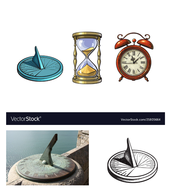
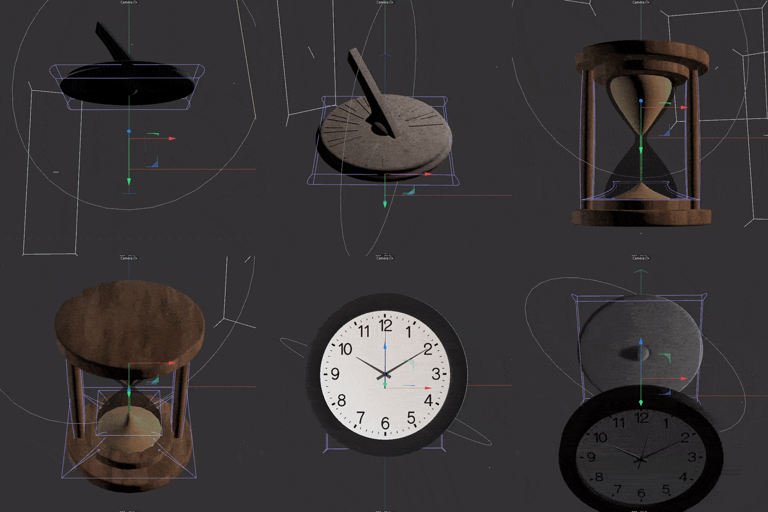
To convey the idea that "in time, you gain new perspectives," I wanted to make something a little scary yet intriguing. I thought it would be a great idea to show a seamless progression of various types of timepieces used throughout history.
Process
Sundial
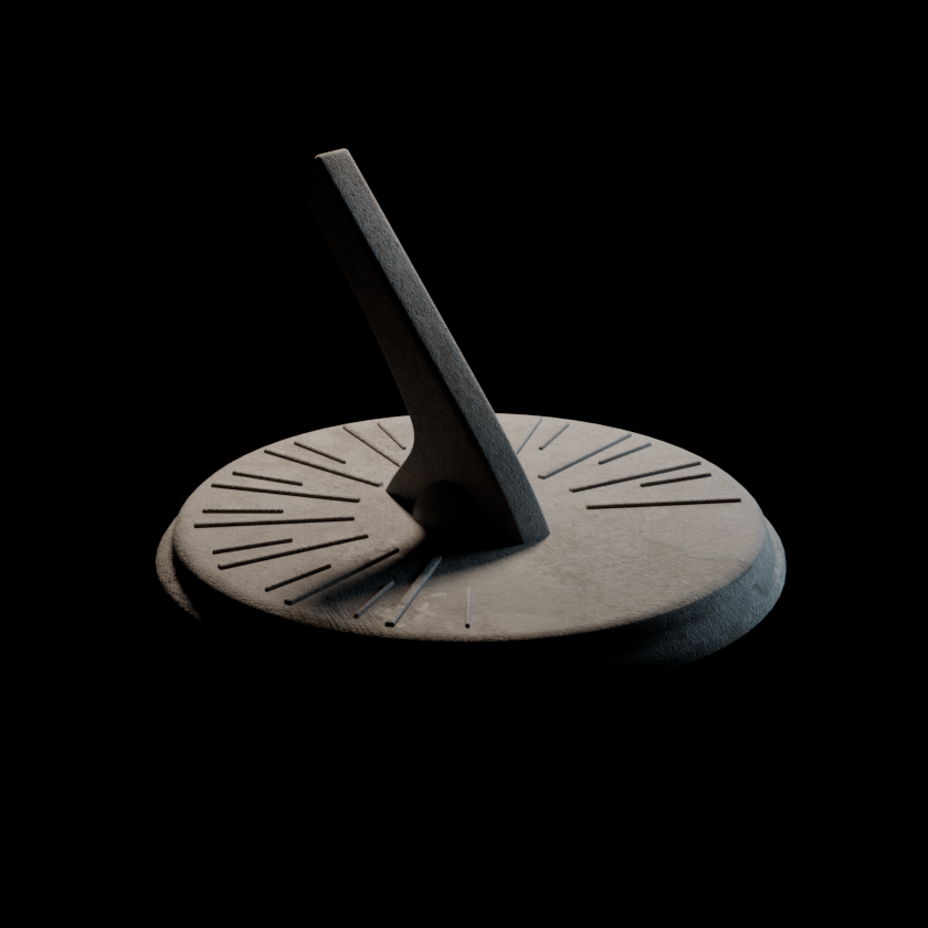
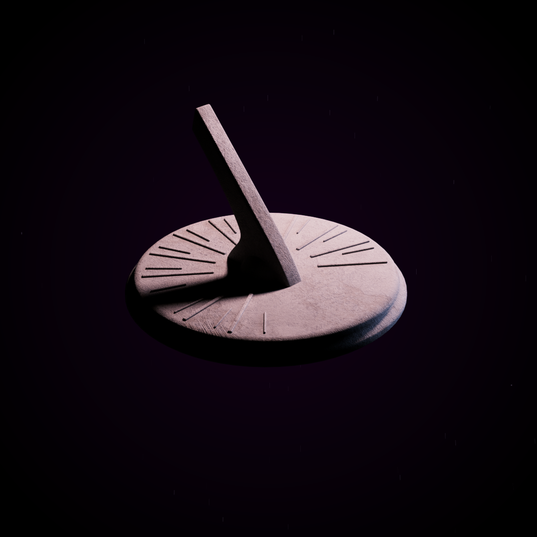
A sundial is essentially an old-school clock that uses the shadow from the sun to tell the time. Through lighting, I used that "shadow catching" aspect of the sundial to establish the piece's eerie mood.
Fun fact: The platform of the sundial is called the "dial plate," and the long piece that sticks out to catch the sun's shadow is called the "gnomon."
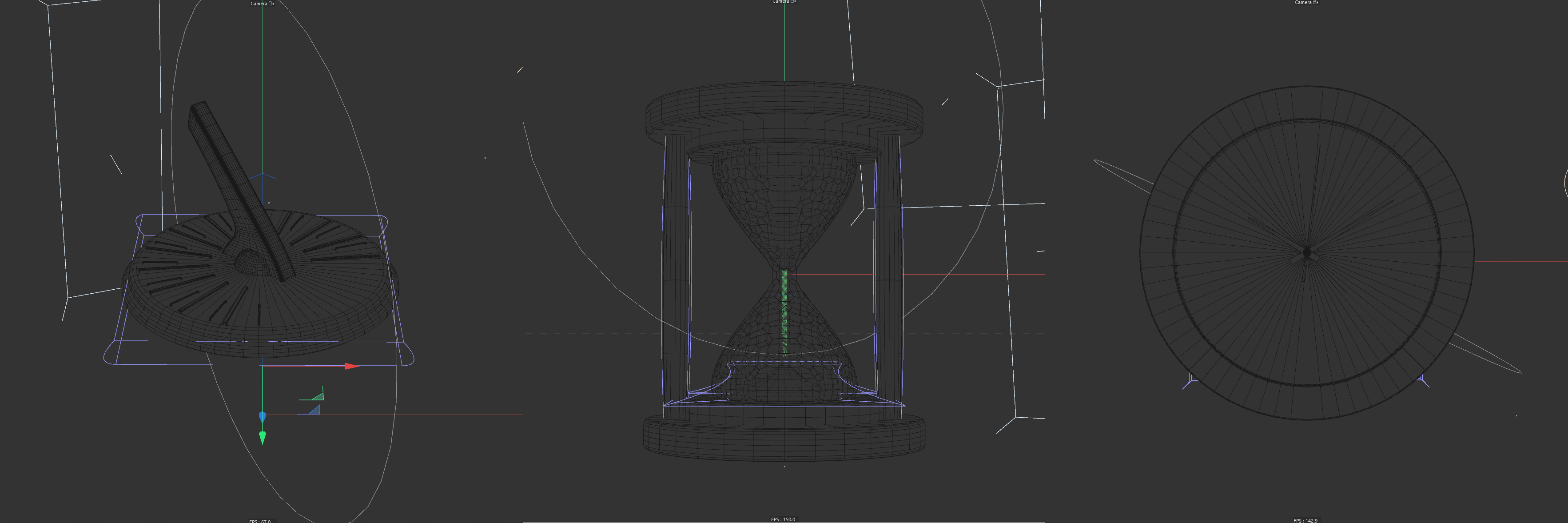
I started by modeling the sundial inside Cinema 4D based on the reference images I gathered during the conception stage.
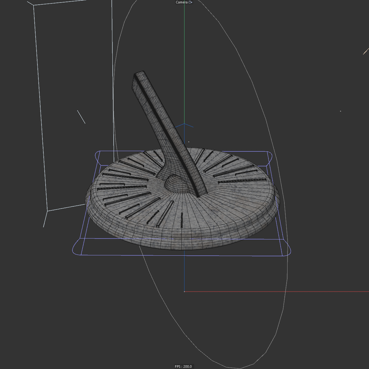
The sundial was created with a cylinder, and the gnomon was made out of a box with a few loop cuts to create its curvy shape.
Hourglass
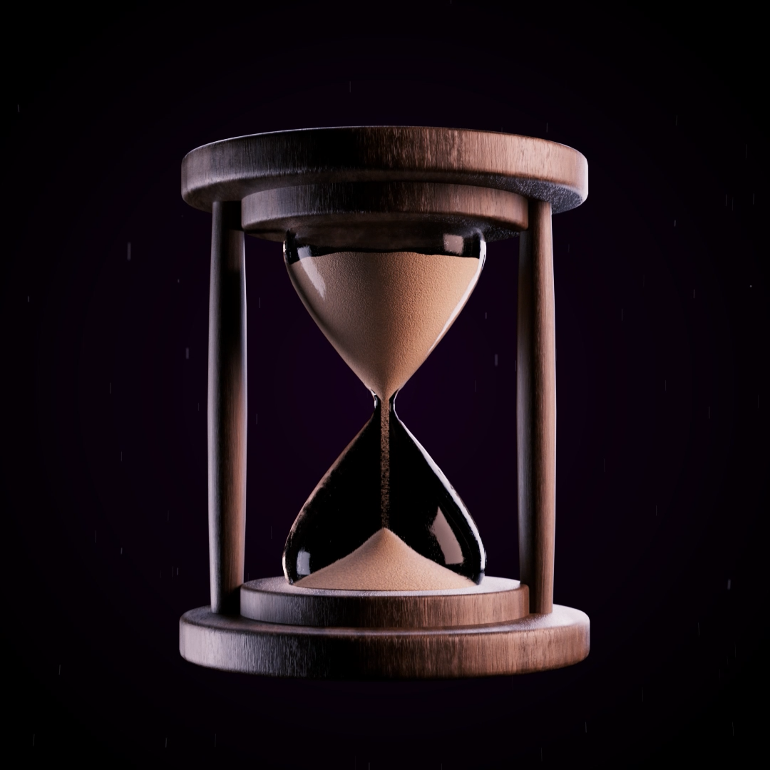
The base of the hourglass was straightforward to make. The hardest part was making the glass bulb itself.
To achieve that proper hourglass shape, I made two rounded cones, flipped one of them over, and then merged them using the volume builder. Pretty neat.
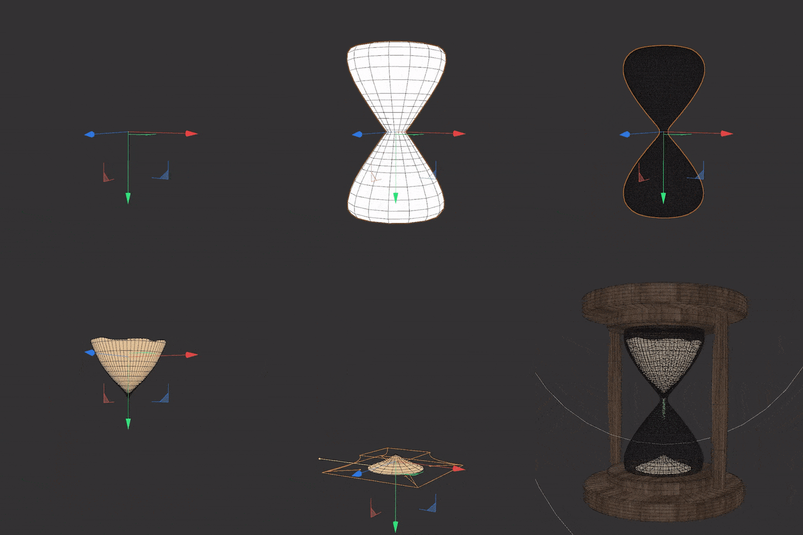
To create the illusion that sand is piling up at the bottom, I animated two Taper and Bugle deformers on a shrunken cone shape with a sand texture applied to it. Then, I used a particle simulation to create that falling sand effect.
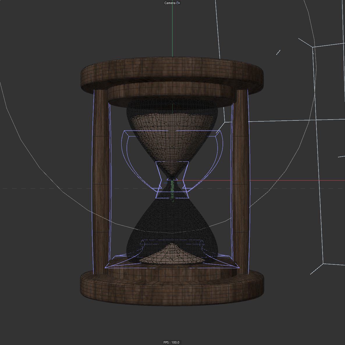
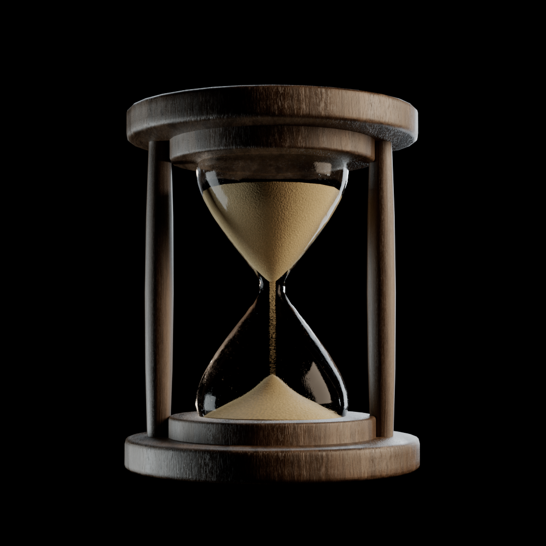
I'm really happy with how this turned out! One thing my acquaintance Martin pointed out is that the refraction of the glass is way too high, making it look like the sand is trapped in a thick chunk of glass. It would just be a thin bulb of glass in a real hourglass. Going to keep notes on realism for next time!
Clock
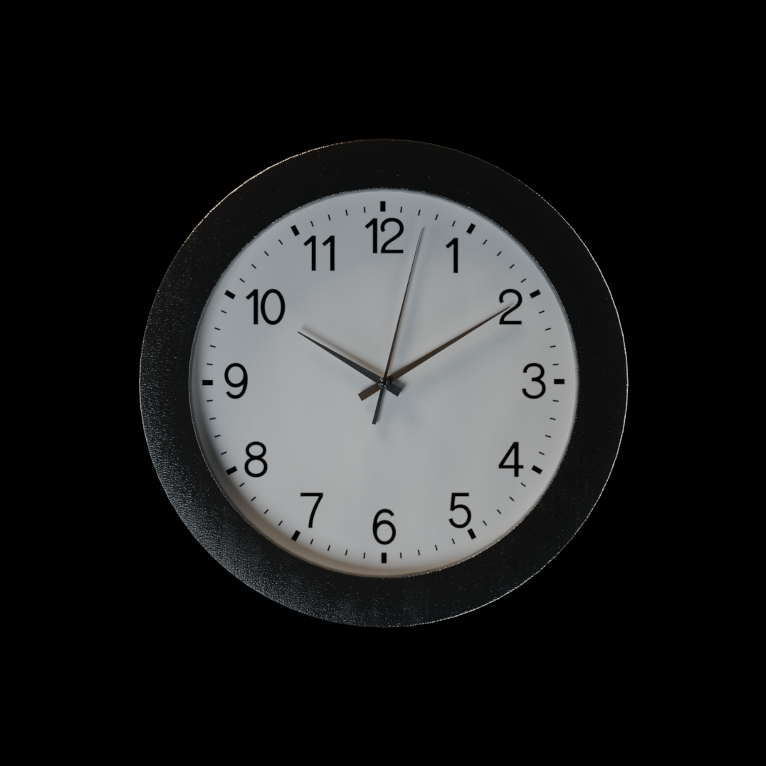
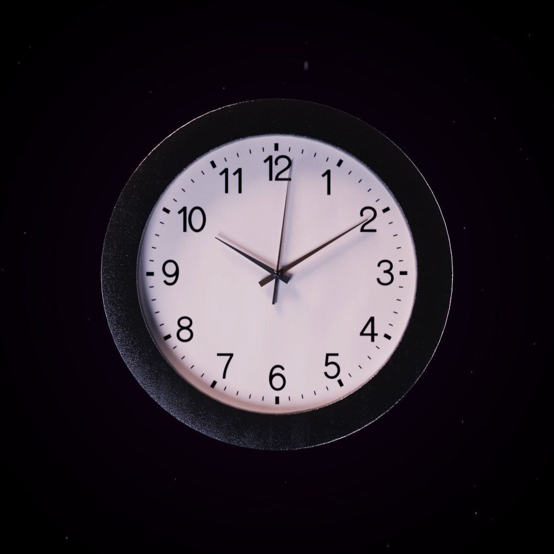
This isn't the first time I made a real ticking clock, it was loosely inspired by my own "Update O'Clock" video I made over five years ago. Second to the sundial, the clock has to be my favorite part of this piece.
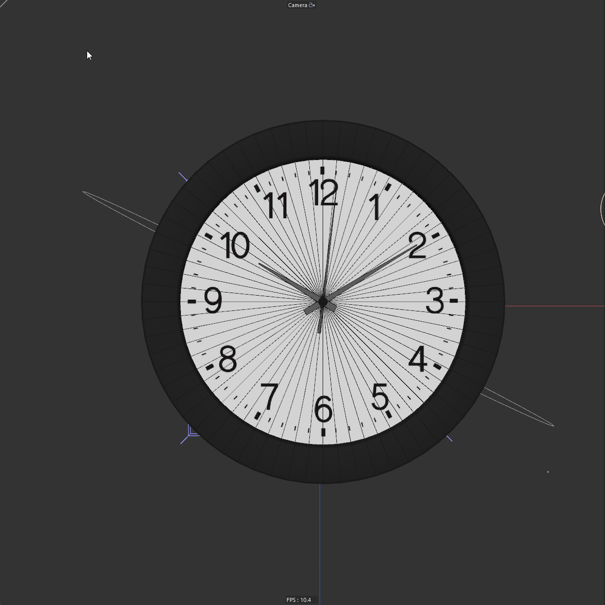
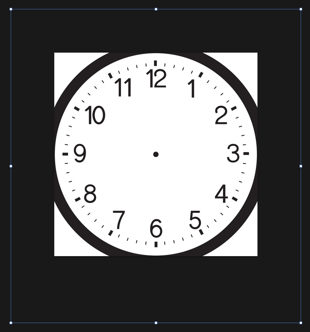
The clock was tricky. I had to make the hands line up with the numbers. I achieved this by finding a clock texture on Google Images, modifying it in Photoshop, then applying that texture to a cylinder in Cinema 4D. It lined up perfectly with the rest of my clock model. This is a similar technique I used way back then but in 3D.
Music and sound design
I have produced everything you hear in this piece in Ableton Live. I wanted something that seemed mysterious yet dark on the inside—something you would see out of The Twilight Zone.
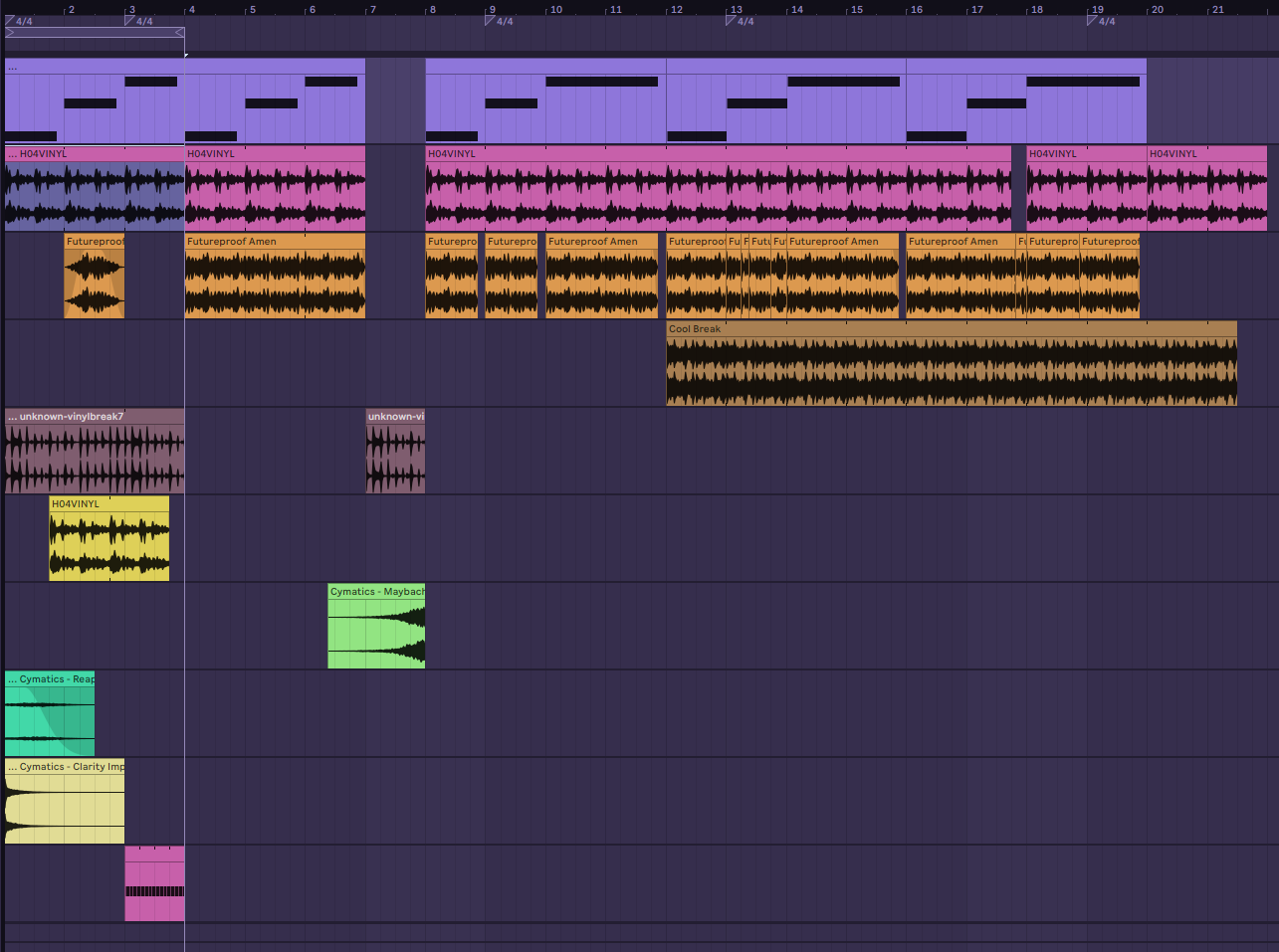
I felt like drum and bass was an excellent genre to do this with, and Il Giradischi E I Tuoi Dischi by The Dining Rooms was a big inspiration when producing this track.
Finished product
Conclusion
I made this so quickly and on the spot that they're a few things I wished I touched up on, but I'm fairly happy with the final result. This piece also served as a good lighting exercise, so that helps too.
Click here to check out the original tweet about my insight on giving things time.