Batch Logo Challenge
Background
Founded by Olamide Rowland (ROJ THE GOAT), Batch is a community for underrepresented motion designers across the world.
The people behind Batch invited everyone in the community to try their hand at giving their take on Batch's new visual identity designed by Chisaokwu Joboson (jobosonchisa).
After seeing so many talented artists take a crack at this challenge, I decided "Why not I enter too?"
Conception
When I saw the new Batch identity, I thought, "That logo almost looks like a gear... Wouldn't it be cool if the star clicked into place like a gear in a typewriter?" This old-school analog concept became the basis of this satisfying animation.
Rule of five
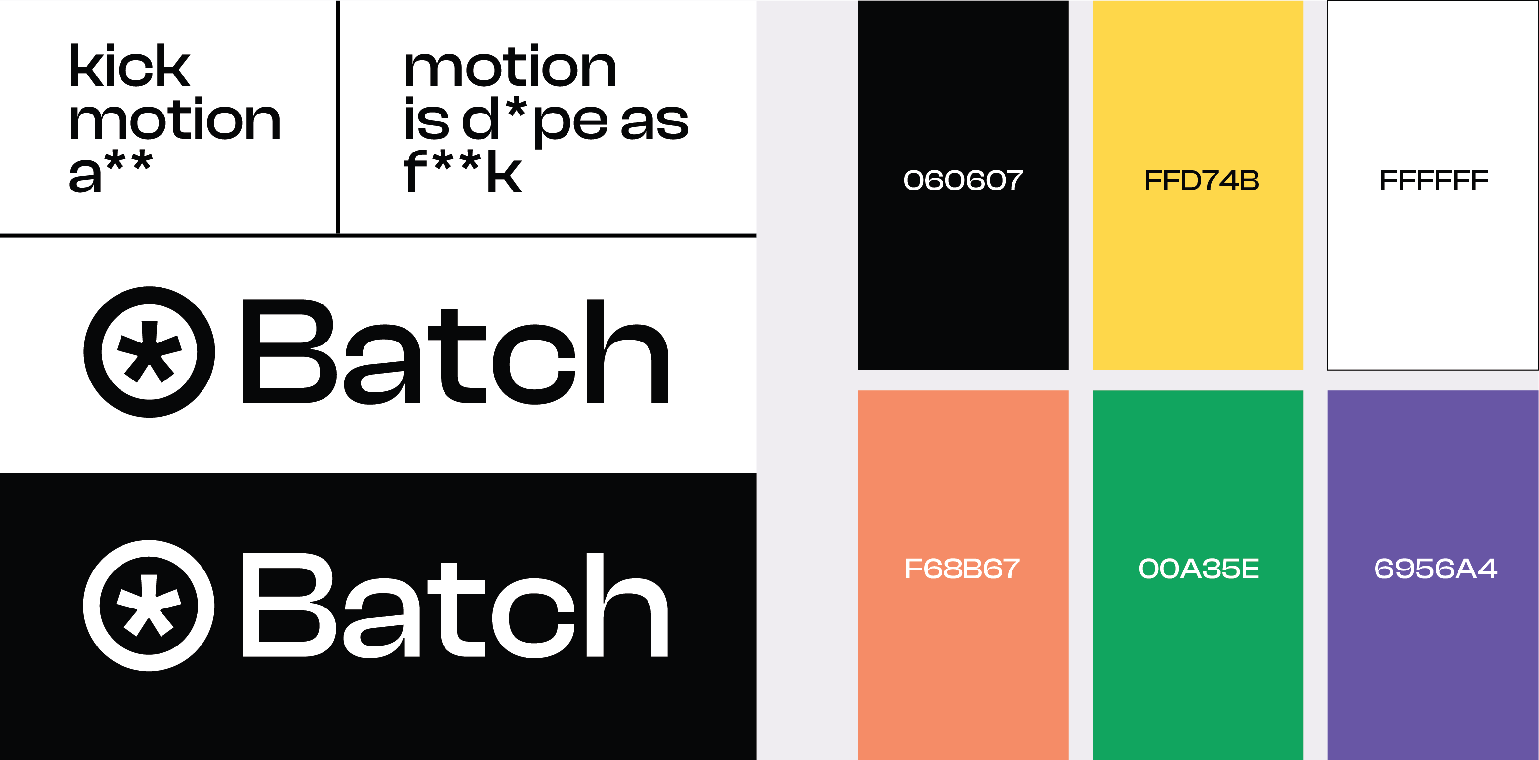
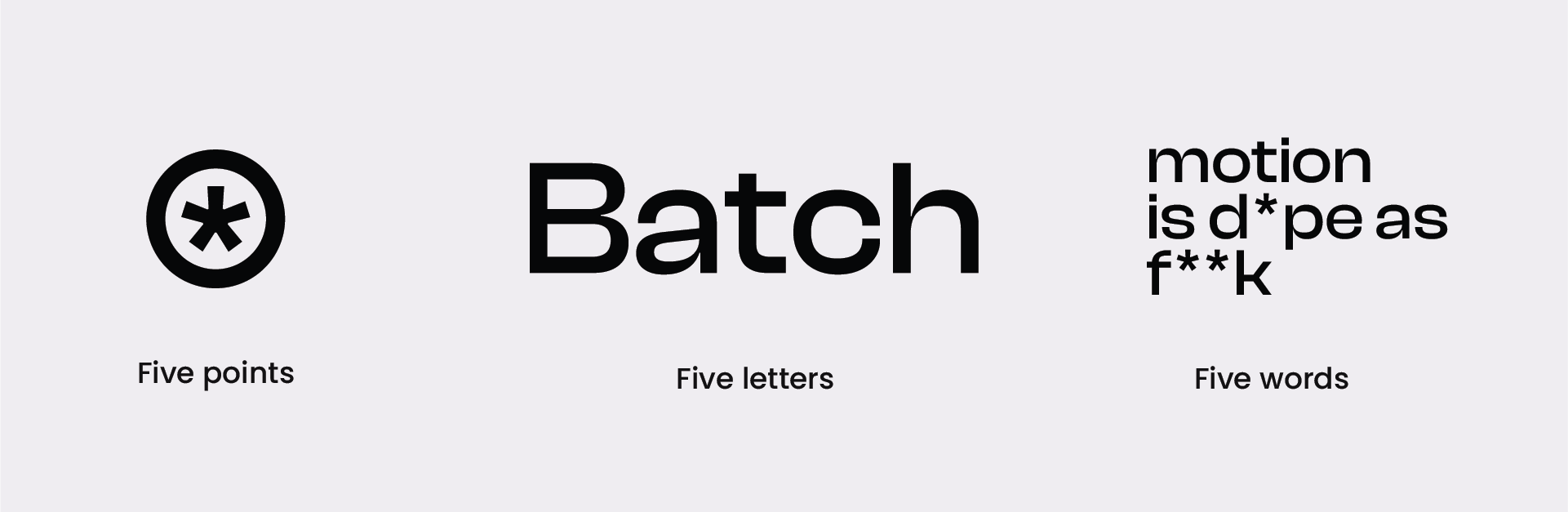
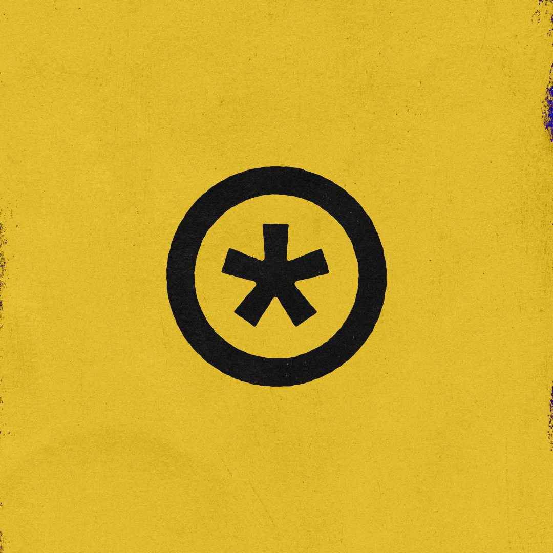
As I looked closer at Batch's visual brand identity, I noticed that it had a recurrent pattern of five.
- The Batch star (*) brandmark has five points.
- The name "Batch" is made up of five letters.
- Batch's tagline "Motion is d*pe as f**k" is made up of five words.
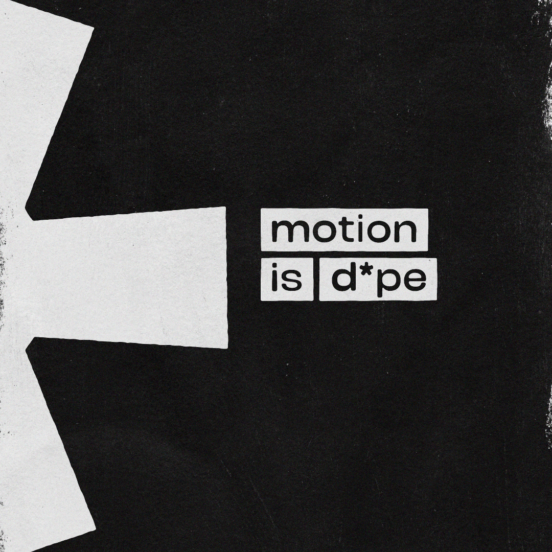
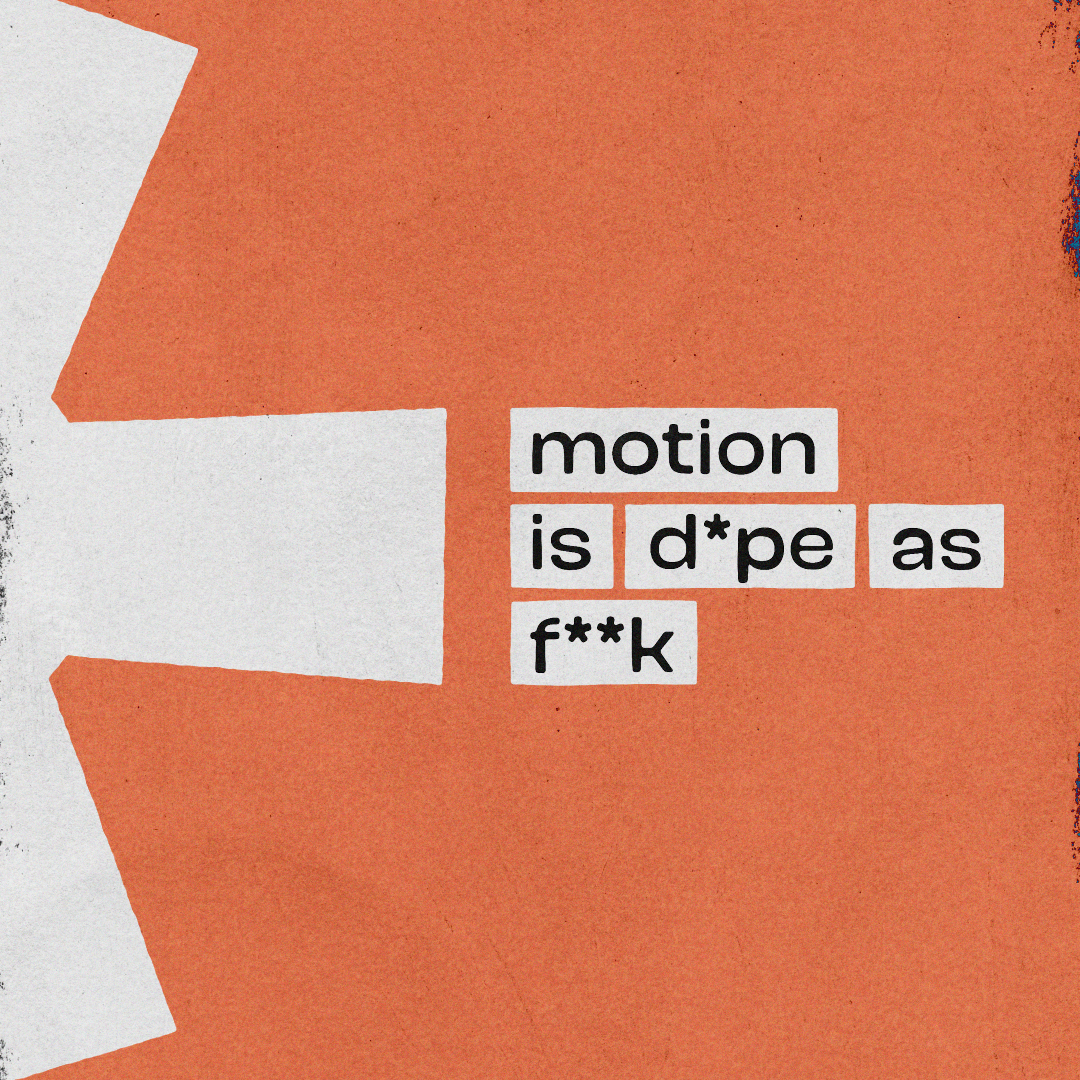
I used these traits as a foundation for the idea that each star's point reveals a word from the slogan, clicking into place five times like a cog.
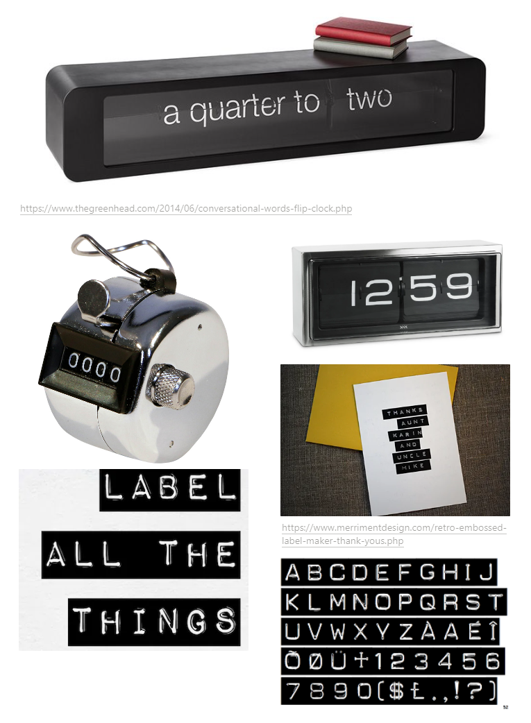
🞳 Star turns into ⚙ Gear
Because I wanted to play on the idea that the Batch star is a cog in a little machine, I took inspiration from old-school analog appliances like exposed flip clocks and typewriters.
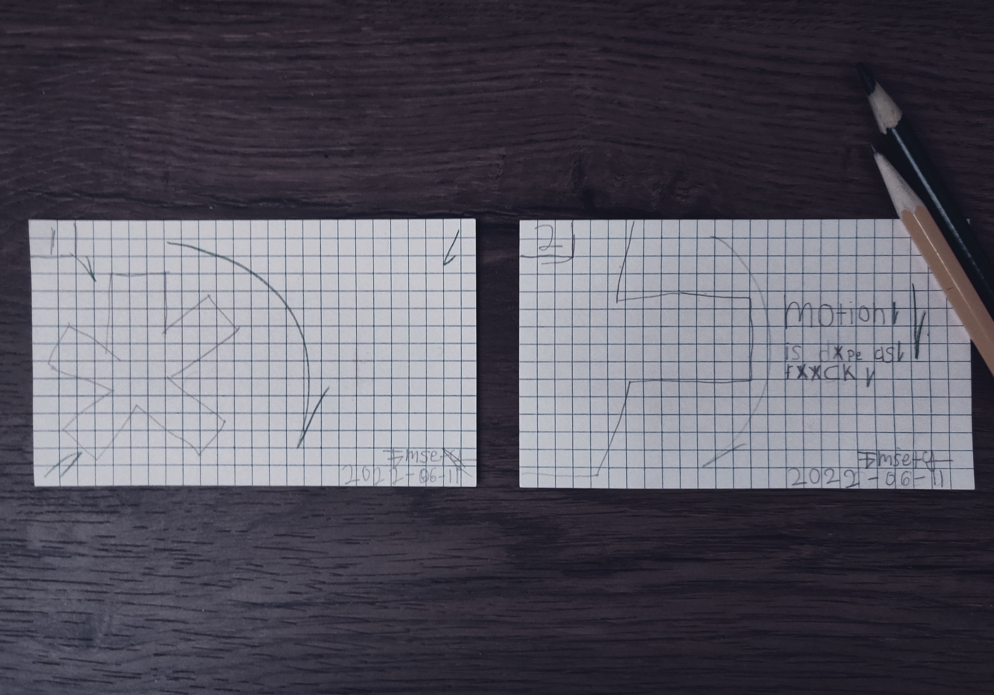
Storyboard
I drew up a quick and dirty storyboard to better understand what I had in mind.
Process
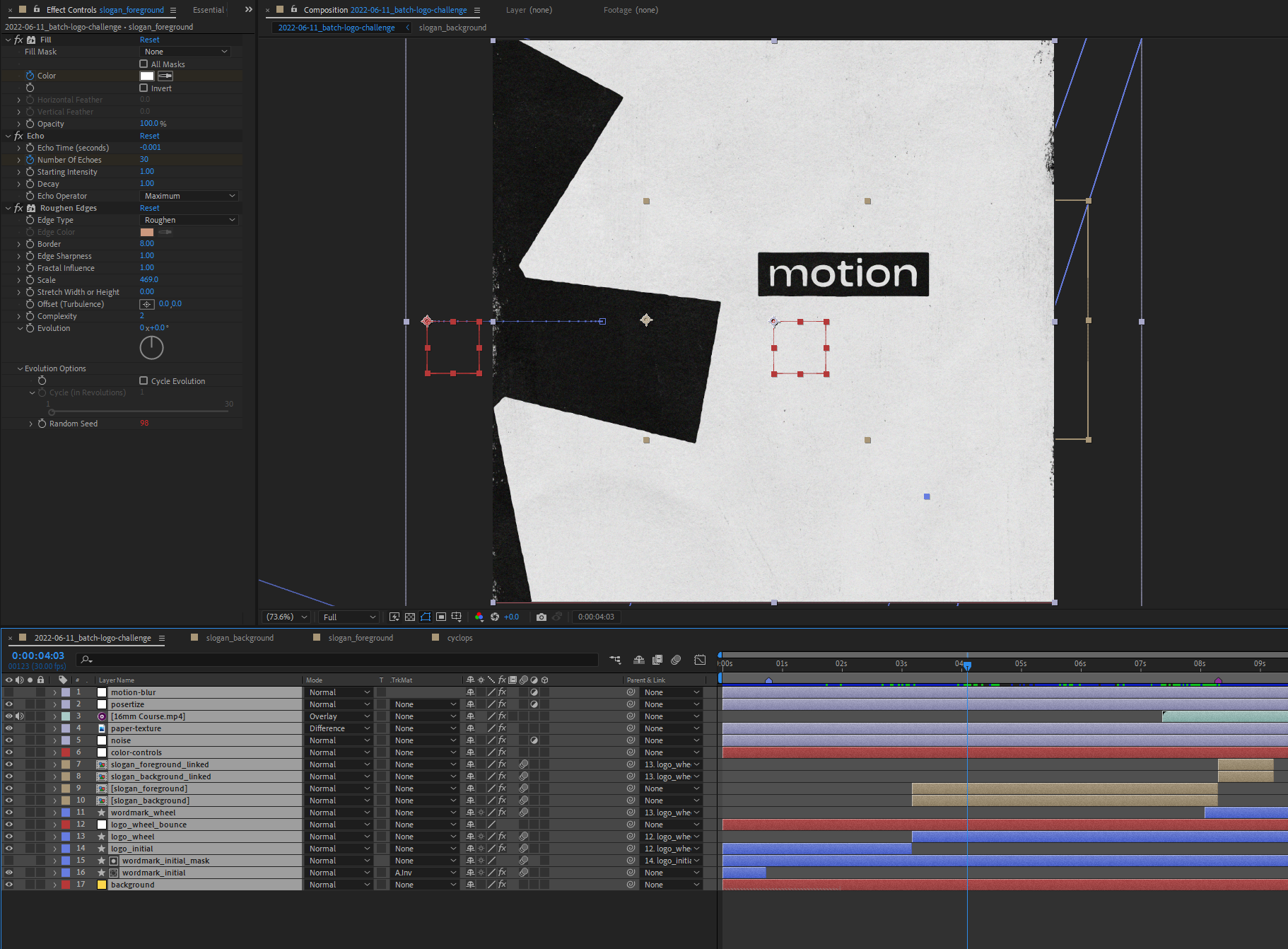
My first attempt for the slogan reveal was to make something akin to an analog ticker. I opened After Effects and built a prototype of a ticker with the CC Cylinder effect and some compositing trickery.
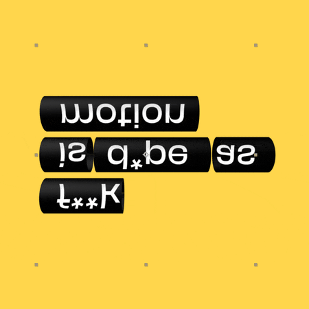
Ultimately, the idea didn't pan out as I wasn't happy with the results. Instead, I arrived at simple flat lettering reminiscent of old-school embossing tape.

I used a combination of alpha mattes and bounce experssions to get that springy reveal effect. Then I used the Echo effect to give it an extra sense of intonation as the text snaps down in sync with the star.
Sound
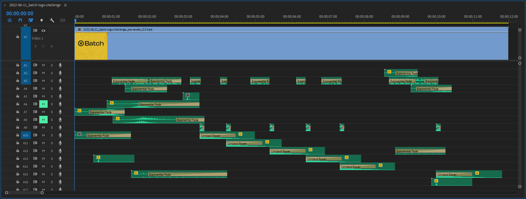
To sell that analog vibe, I knew that getting the sound design right was paramount for the idea to come off correctly.
The goal was to have a tactile and clicky feel to the visuals while conveying that the ticking logo and the revealing slogan are connected.
I layered and mixed various tactile sounds inside Premiere Pro using sounds from Daruma Audio, Zapsplat, and Freesound.
Finished product
Conclusion
This piece was super fun to make, and I had a good time figuring out how to execute a simple yet elegant idea.
The response to this piece on Twitter has been amazing, and I appreciate anyone who engaged or shared my entry.
And of course, all credit goes to the people behind Batch and its community for the inspiration behind this challenge.